An icon set for a website or app: how to plan and order it
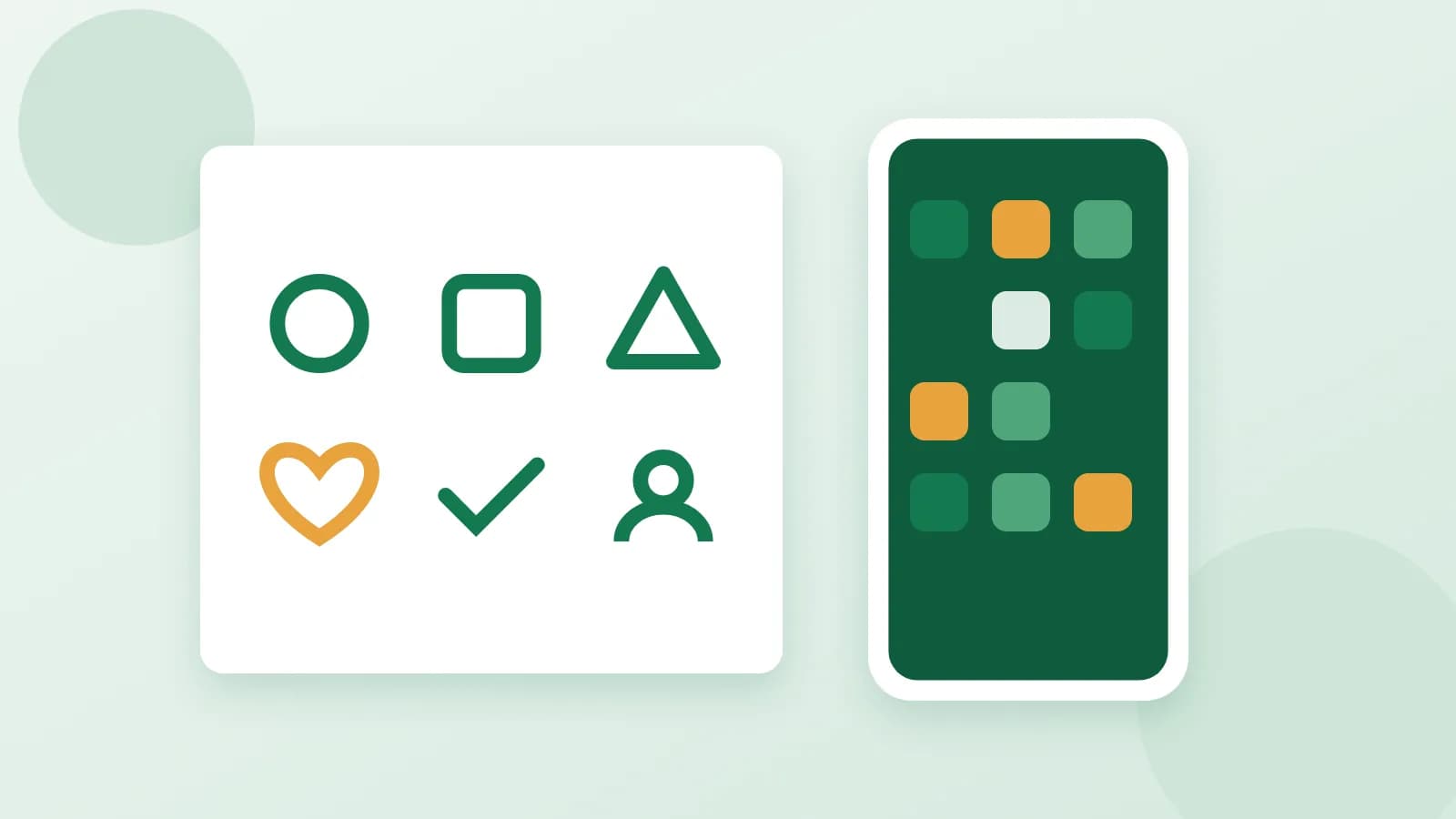
Icons are the small pictures that tell people where to tap: home, cart, delivery, support, profile. When they come from different free packs, a site looks patched together, with thick lines next to thin ones and round corners next to sharp ones. A matching set fixes that and makes even a simple site look finished. Here is how to plan one.
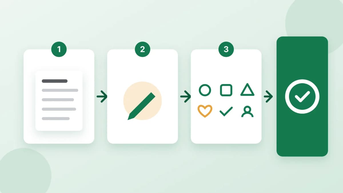
Make a list before anything else
Walk through your site or app and write down every place an icon would help:
- Main menu: home, catalog, search, cart, account.
- Features or benefits: fast delivery, secure payment, returns, support.
- Contacts and actions: phone, email, location, share, download.
Describe each icon in a few words, for example "delivery: a small van" or "returns: a box with an arrow". The clearer the list, the fewer changes later.
How many icons you need
- About 4: a landing page with three or four benefits, or a short presentation.
- About 8: the main sections and features of a small site.
- About 16: a full set for an app or a larger site with many sections.
It is usually better to order a few more than you need today. Icons drawn later, in a separate order, are harder to match exactly.
Choose one style
Pick one style and keep it for the whole set:
- Outline: thin lines, light and modern, good for clean interfaces.
- Filled: solid shapes, easy to read at very small sizes.
- Duotone: two shades of one color, a little more character.
- 3D: soft volume and shadows, good for bright landing pages.
If you already have a few icons you like, share a link to them so the new ones follow the same look.
Colors
Use your brand colors and give them as hex codes, such as #1A73E8, if you have them. One main color and one accent are usually enough. If you have no brand colors yet, a neutral palette works on any background.
Small sizes decide everything
An icon in a menu is often only 24 pixels wide. At that size details disappear, so simple shapes win:
- One idea per icon. A van for delivery, not a van with a road, a clock and a box.
- No text inside. Words become unreadable when the icon is small.
- Familiar symbols. A magnifier for search and a cart for shopping are understood everywhere.
What you get and how to use it
A typical set comes as separate PNG files on a transparent background, so each icon can be placed on any color. PNG is a raster format: it is fine for websites, apps and slides, but it is not a vector file you can enlarge without limits. If you need a favicon, a free online converter turns a PNG into an ICO file in a minute.
In short
A clear list, the right number of icons, one style and your brand colors: that is how a set looks consistent on every screen. If you would rather have the set drawn for you, order an icon set: you send the list of icons, the style and your colors, and get 4, 8 or 16 matching icons as separate PNG files on a transparent background. Payment is released only after you approve the work.