 Design
Mobile checkout
Mobile checkout in your site style
Pricefrom $10
The money is reserved when you pay and released only once you accept the work.
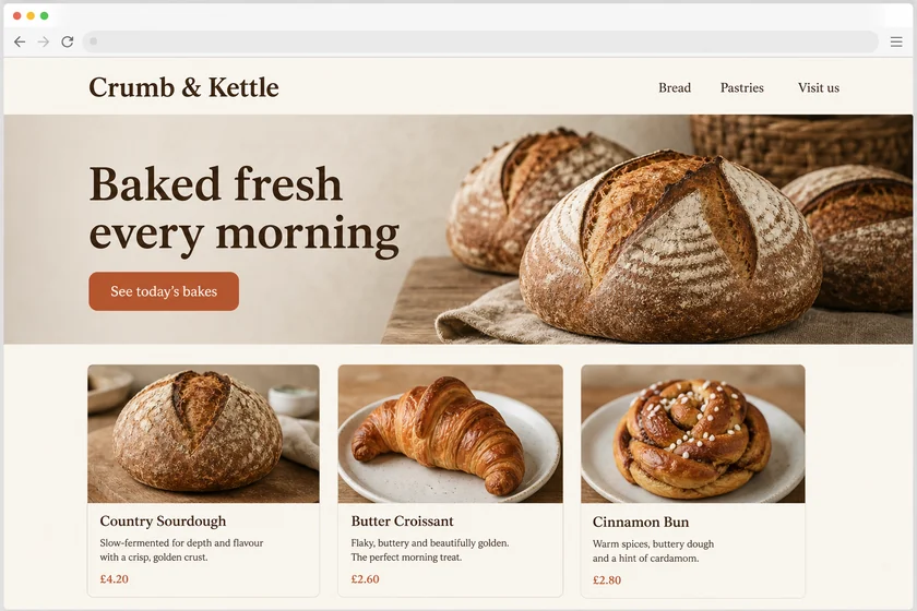
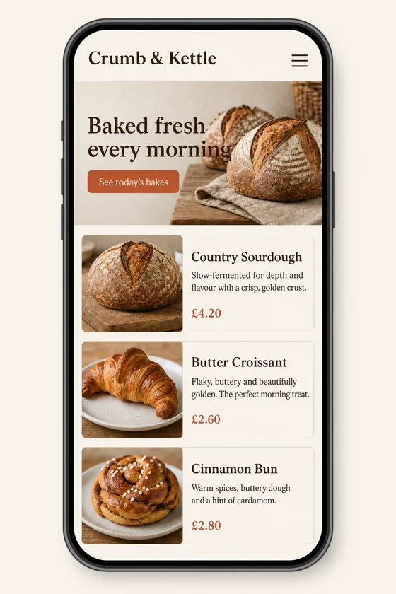
File: PNG mock-up, about 1.5 megapixels. A picture of the design for the client's developer, not HTML code or a Figma file.
Client: Crumb & Kettle, a neighbourhood bakery. Task: show how their homepage should look on a phone, keeping the fonts, colours, button and photos of the desktop site.
The client and all details are made up.
A mobile menu is the screen people open when they are lost, so it has to show your main sections at a glance, fold long category lists into tap-to-open groups and keep search, account and cart within easy reach. We draw your site's menu for a phone in the style of your screenshot: the closed header with its menu icon, the opened drawer or full-screen menu, and nested categories, using your section names. Every picture is made from one of your screenshots as an upright 2:3 PNG mock-up of about 1.5 megapixels, whatever the shape of the upload, so a desktop screenshot with a wide navigation bar works as well; you get a picture, not menu code or a Figma file.
Up to 5 sharp screenshots as PNG, JPEG or WebP (no PDF) of your site's header and navigation, on desktop or phone, from a site you have the right to use; a sample from another site is used only for its style. Send your menu items and sub-items in order exactly as they should read, and say what else belongs in the menu, such as search, account, language or phone.
We will ask you:
| Packages | Basic1 mobile screen$10 | Standard3 mobile screens$22 | Premium5 mobile screens$39 |
|---|---|---|---|
| Deadline | 1 day | 1 day | 2 days |
| Revisions | 1 | 2 | 3 |
| Mock-ups | 1 | 3 | 5 |
| Format | PNG | PNG | PNG |
| Screens | your choice | your choice | your choice |
| Order Basic | Order Standard | Order Premium |
You pay when you order, but the money is released only for accepted work.
A phone menu usually reads best with about five to seven top items; longer lists are folded into groups or moved to a second level. If your menu has dozens of categories, a bigger package lets us show the top level and two opened groups as separate upright 2:3 mock-ups.
The result is a PNG picture of the menu, not HTML, CSS or JavaScript, not a Figma file and not a menu setting for WordPress, Shopify, Wix, Squarespace or Webflow. Your developer or you build it; check what your theme's current mobile menu options allow before choosing a layout.
Short menu labels are drawn into the picture, and Latin-script languages such as German or Spanish come out cleanest; small text can still come out imperfect, so check every item. Because the picture is redrawn, icons and your logo can shift slightly; a revision corrects what is off.
Yes, for its style only: the layout, mood and colours. We never take its logo, brand or texts, we don't draw other brands' logos such as social network icons, we add no fake reviews or ratings, and we don't change documents or official forms. Your section names and logo go in, and the files you send must be ones you have the right to use.
Did not find your answer?
Design Design
 Design
 Design