 Design
Mobile homepage
Mobile homepage in your site style
Pricefrom $10
The money is reserved when you pay and released only once you accept the work.

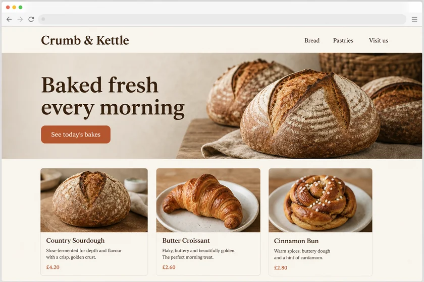
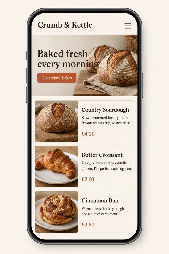
File: PNG mock-up, about 1.5 megapixels. A picture of the design for the client's developer, not HTML code or a Figma file.
Client: Crumb & Kettle, a neighbourhood bakery. Task: show how their homepage should look on a phone, keeping the fonts, colours, button and photos of the desktop site.
The client and all details are made up.
A desktop page with three columns, a wide menu and side-by-side blocks does not simply shrink onto a phone: the columns have to stack, the menu folds into a menu button and buttons grow big enough to tap with a thumb. Upload a screenshot of your desktop page and we draw how the same page could look on a phone, with your colours, fonts and block order kept, so your developer sees the target before touching the code. Each picture is made from one of your screenshots and always comes out as an upright 2:3 PNG mock-up of about 1.5 megapixels (about 1024 x 1536 pixels), whatever the shape of the upload, so even a wide desktop screenshot becomes a phone screen; you get a picture, not code or a Figma file.
Up to 5 sharp screenshots of your desktop pages as PNG, JPEG or WebP (no PDF), one page per file, of a site you have the right to use. For each one, tell us which blocks must come first on the phone, which can be dropped or folded away, and the headings and button labels exactly as they should read. For a long page, send the part you need or split it across several mock-ups.
We will ask you:
| Packages | Basic1 mobile screen$10 | Standard3 mobile screens$22 | Premium5 mobile screens$39 |
|---|---|---|---|
| Deadline | 1 day | 1 day | 2 days |
| Revisions | 1 | 2 | 3 |
| Mock-ups | 1 | 3 | 5 |
| Format | PNG | PNG | PNG |
| Screens | your choice | your choice | your choice |
| Order Basic | Order Standard | Order Premium |
You pay when you order, but the money is released only for accepted work.
No. In this offer every picture is an upright 2:3 phone screen of about 1024 x 1536 pixels, whatever the shape of your upload, so a wide desktop screenshot is redrawn as a tall mobile page. A very long page does not fit one phone screen in detail, so it is shown in a compact form; split it into several mock-ups to see each part.
Not by itself. You get PNG pictures of the phone layout, not HTML or CSS code, not a Figma or XD file and not a theme setting. Your developer or you rebuild the page from the picture; on Shopify, WordPress, Wix, Squarespace or Webflow check what your theme's mobile settings currently allow, as we don't change anything on your site.
Headings and button labels you give us are drawn into the picture, so keep them short; body text appears as placeholder lines. The picture is redrawn, so small text, icons, fonts and your logo can come out slightly different or imperfect, and Latin-script languages come out cleanest. Check every word and ask for a revision.
You can send your own site, or a sample you like with your own content in the brief. A sample made by someone else is used only for its style, never for its logo, texts or pictures, and we put no other brands' logos on the screen. We don't recreate documents, certificates or official forms, and we don't add fake reviews, ratings or awards.
Did not find your answer?
Design Design
 Design
 Design