Pitch deck structure: the 10 slides investors expect

An investor spends a few minutes on a startup's first deck, often less. In that time they need to understand what problem you solve, why you are the ones to solve it and how much money there is in it. Everything else they will ask about in the meeting, if there is one.
Here is a ten-slide structure that covers a first introduction, and tips on getting people to read it to the end.
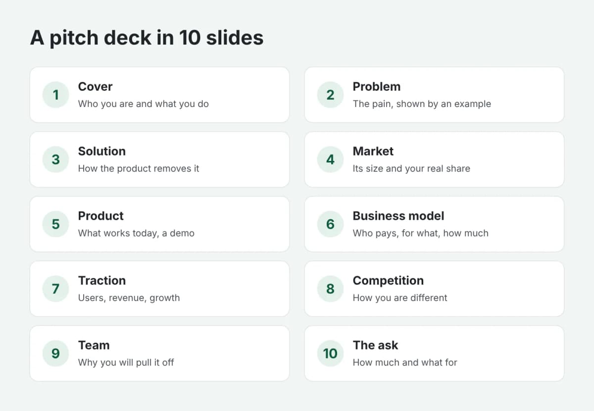
The 10 slides investors expect
1. Cover
Your company name, one sentence about what you do, and contacts. "Grocery delivery in 15 minutes for suburban neighborhoods" beats "A next-generation innovative platform".
2. Problem
What pain you solve for customers and how serious it is. A concrete example works best: one person, one situation, a clear loss of time or money.
3. Solution
How your product removes that pain. A screenshot, photo or simple diagram works better than a paragraph of text.
4. Market
How many people or companies have the problem and how much they are willing to pay. Show not only the total market but also the share you can realistically win in the next few years, and explain how you calculated it.
5. Product
How it works and what already works today. If you have a demo, add a link or a QR code.
6. Business model
Who pays, for what and how much. Average order value, purchase frequency, margin: if you already have the numbers, show them.
7. Traction
Users, revenue, monthly growth, pilot customers, signed agreements. Even small but real numbers are more convincing than any forecast.
8. Competition
Who else solves this problem and how you are different. A comparison table or a two-axis chart reads faster than text. "We have no competitors" usually raises doubts.
9. Team
Who the founders are and why they are the ones who will pull it off. Industry experience, past projects, key skills: one or two lines per person.
10. The ask
How much you are raising, what the money is for and what you will achieve with it: "12 months of runway, launch in three cities, 10,000 paying customers".
Design it so people read to the end
- One idea per slide. A slide title is a conclusion, not a topic: not "Market" but "The market grows 20% a year".
- Minimal text. If a slide cannot be read in 10 seconds, split it or simplify it.
- Big numbers. The key figure on a slide should stand out at first glance.
- Consistent style. The same fonts, colors and spacing on every slide are a sign of a careful team.
- Two versions. One for presenting in a meeting, with minimal text. Another for sending by email, with notes, so it makes sense without you.
Common mistakes
- Too many slides. Nobody will sit through thirty slides at a first meeting: move the details to an appendix.
- Unfounded forecasts. "100x growth in three years" charts with no explanation undermine trust in the whole deck.
- No ask. If the deck never says how much you are raising and for what, the money conversation may never start.
In short
A good investor deck is ten slides, each answering one question. If you already have your key points but no time to design the slides, order a presentation: you send your outline and get a finished file in PowerPoint and PDF. Payment is released only after you approve the work.